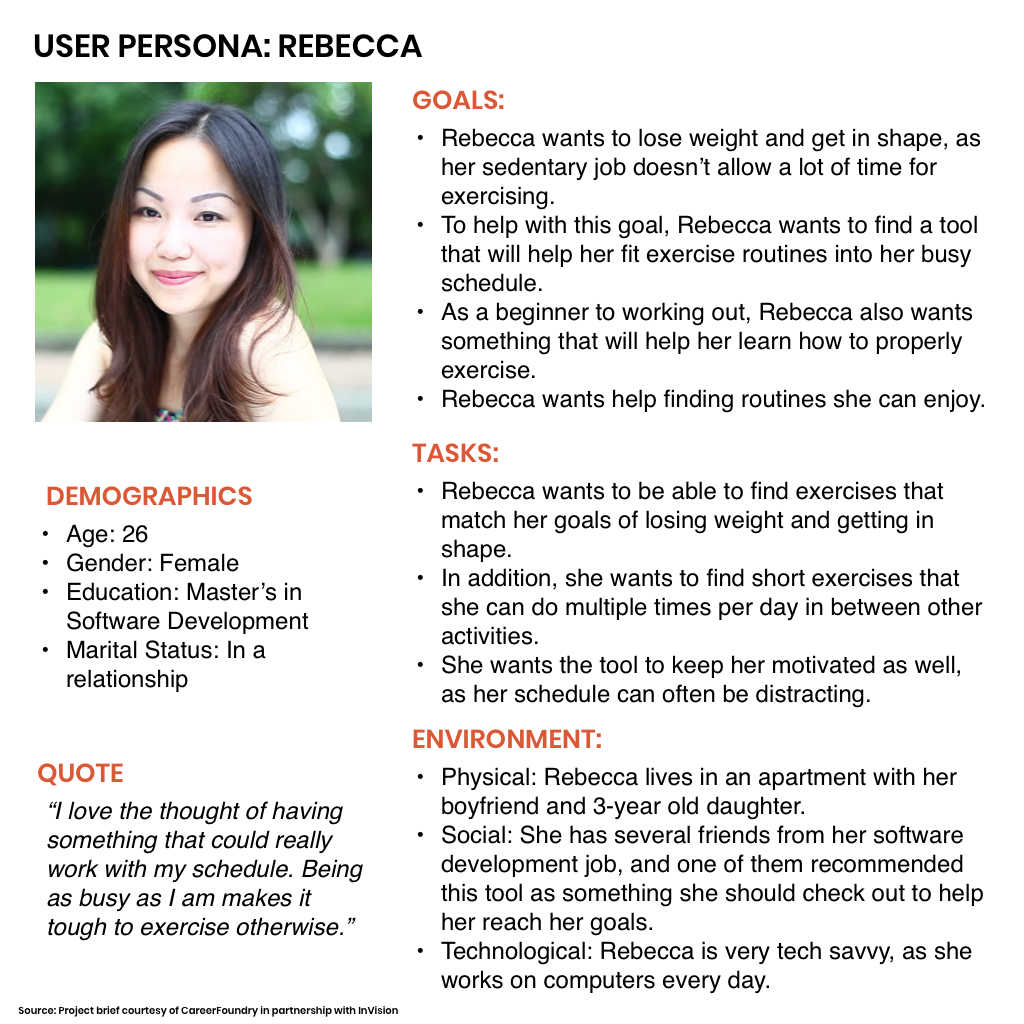
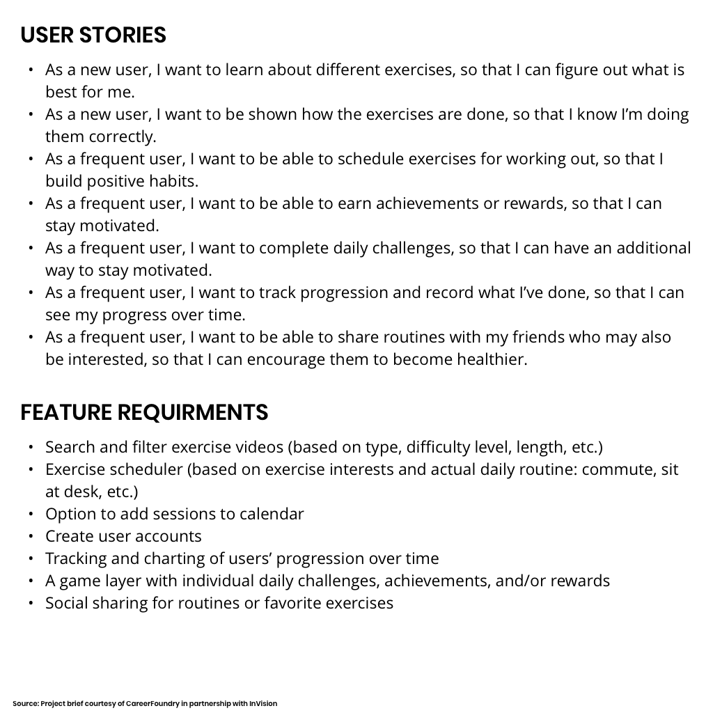
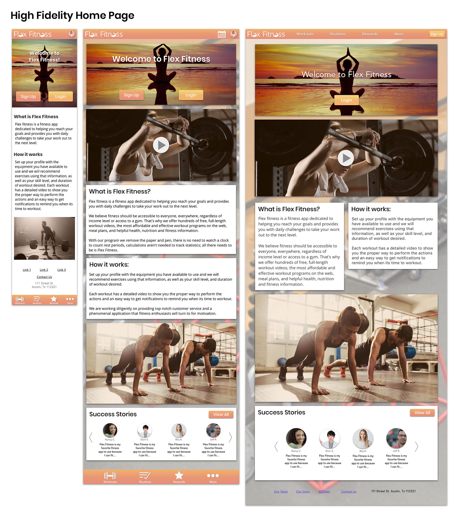
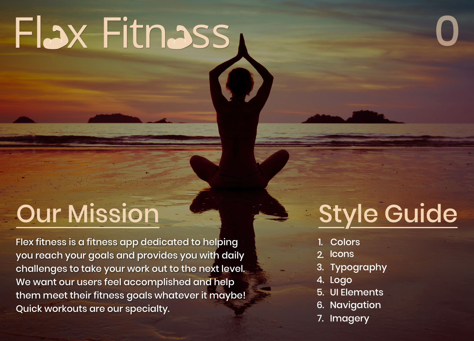
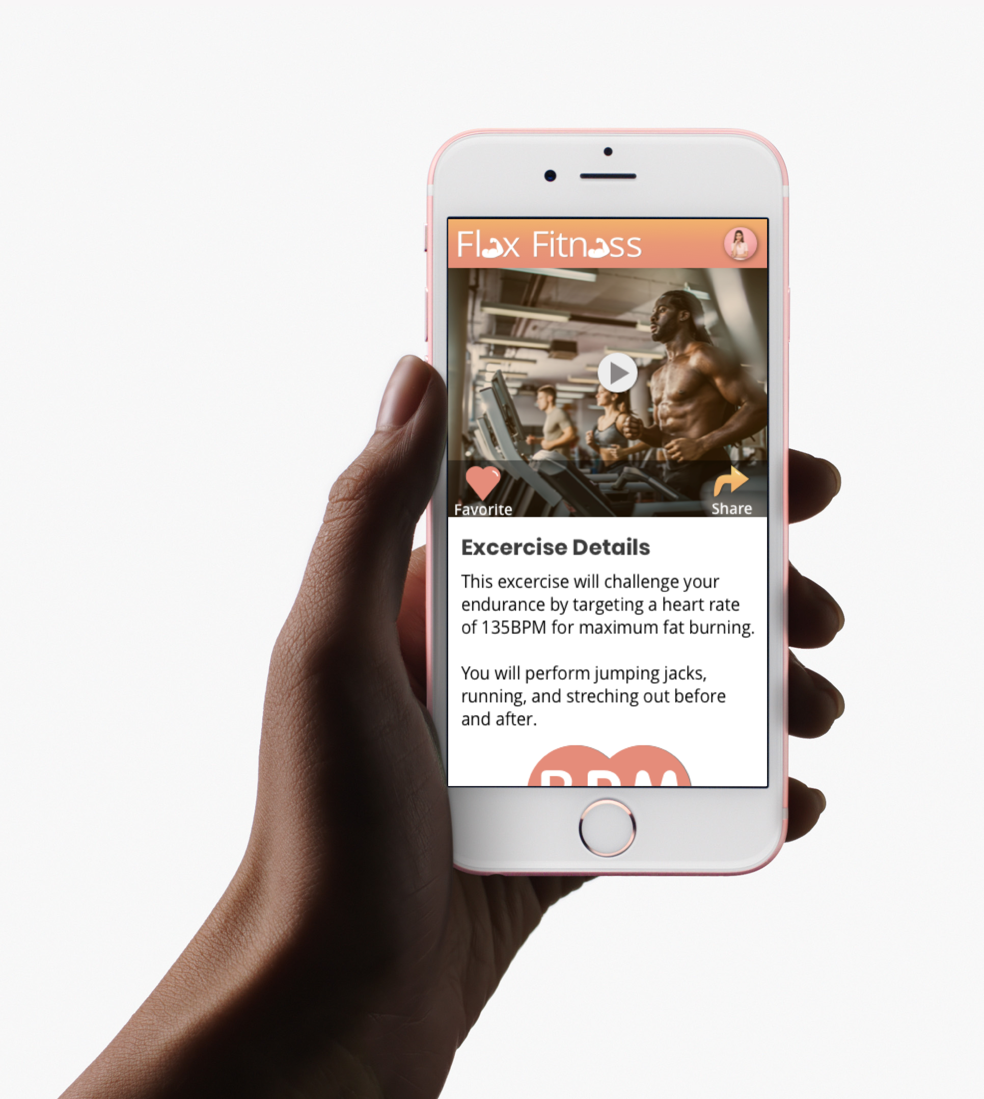
Flex fitness is a fitness app dedicated to helping you reach your goals and provides you with daily challenges to take your work out to the next level.
We believe fitness should be accessible to everyone, everywhere, regardless of income level or access to a gym. That's why we offer hundreds of free, full-length workout videos, to create the most affordable and effective workout programs on the web with helpful health and fitness information.
With our program we remove the paper and pen, there is no need to watch a clock to count rest periods, calculations aren't needed to track statistics; all there needs to be is Flex Fitness.
My Role: UI Designer. Icon Design. Style Guide Creation. User Flows. UX Designer. Wireframing. Mockups. Prototypes.
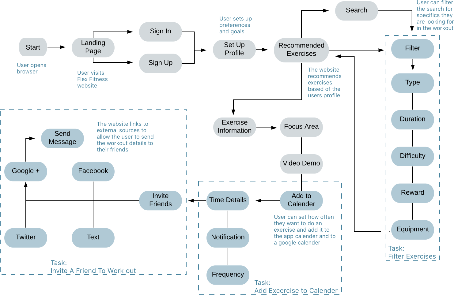
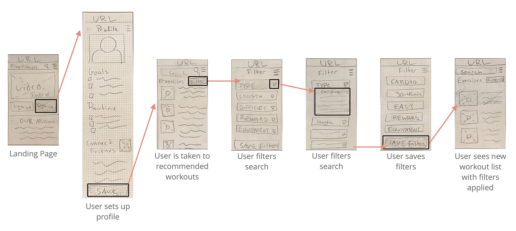
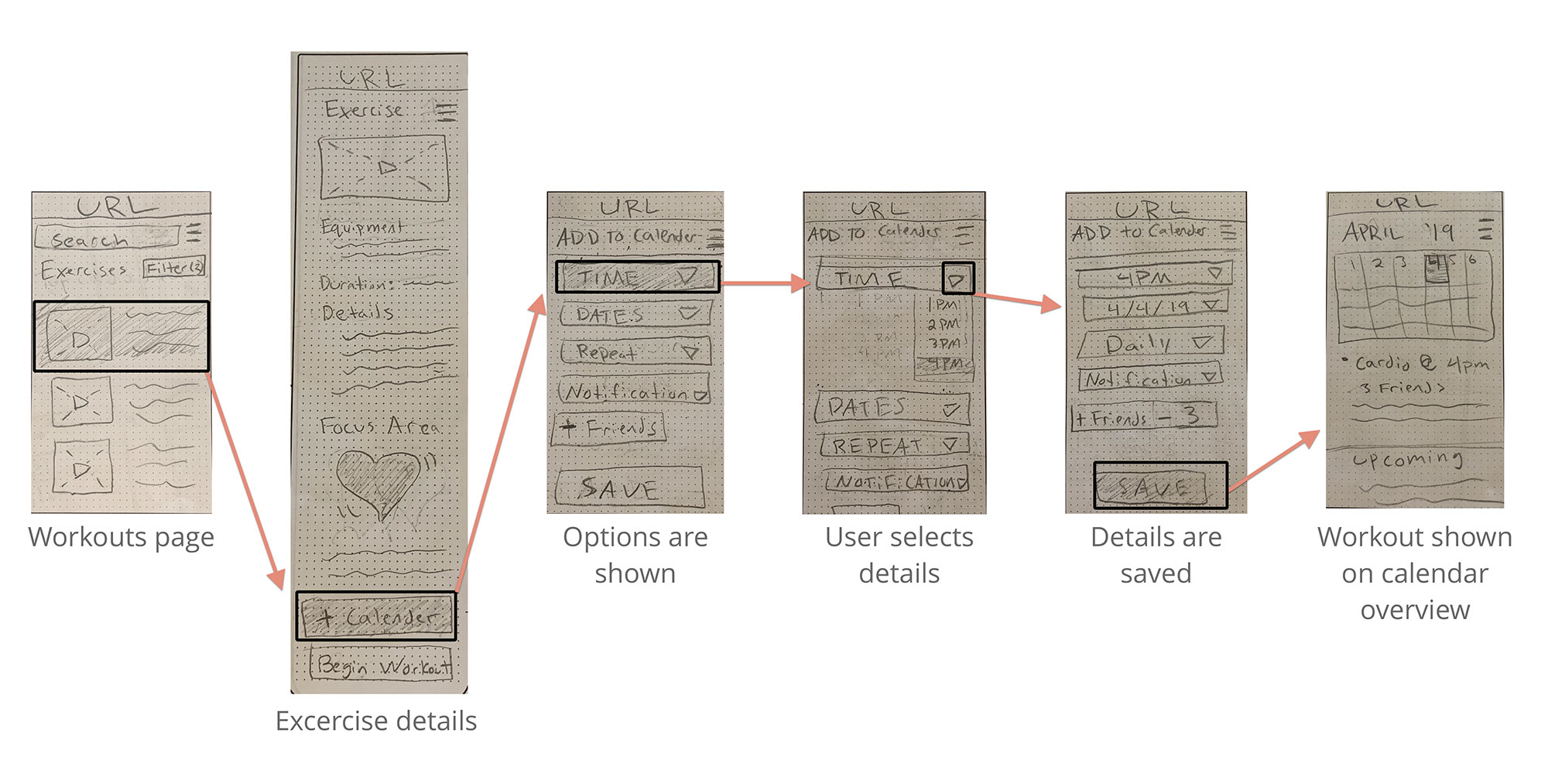
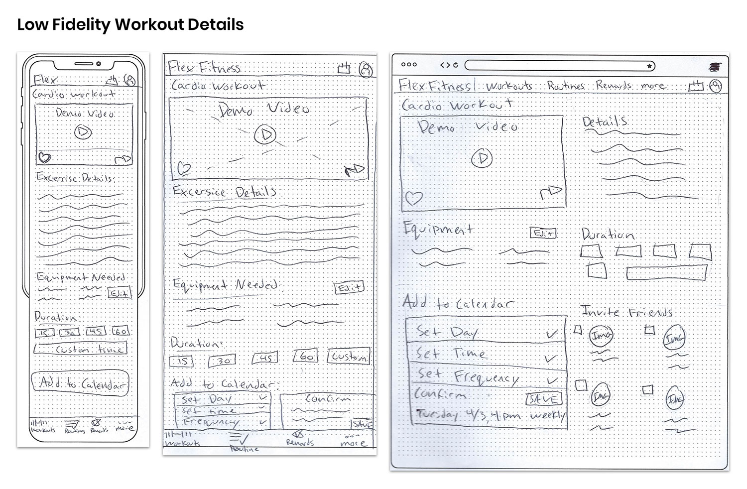
Low-fidelity prototyping is an essential step in the design process. It allows me to test that the flows laid out in my wireframes actually work, before I put time and resources into bringing my designs to life. This process also helps me visualize what screens the users will want and need to see throughout the app!
Because this app was developed using a mobile first approach, most of the user flows were created with low fidelity, mobile wireframes.
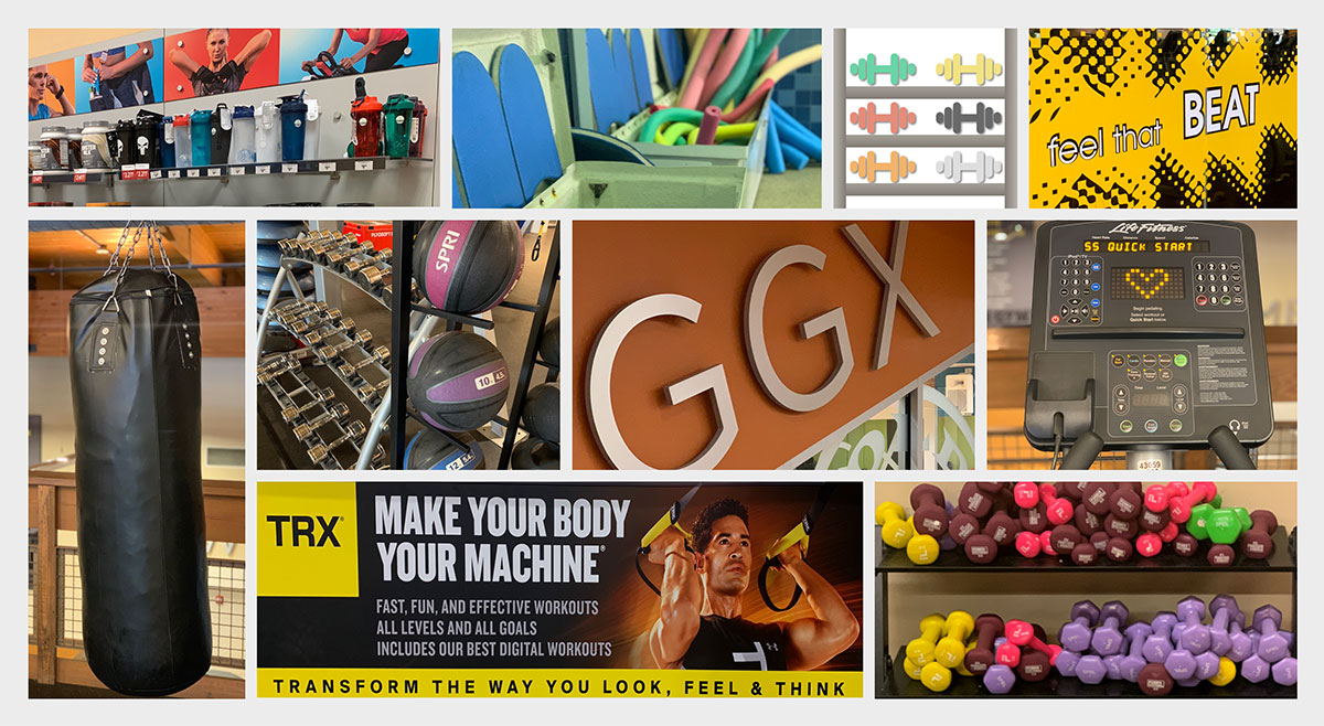
My mood board was created as the first step of my UI design process. It’s was important to establish the mood and story I wanted to tell before diving directly into designing.
This cohesive mood is in alignment with what my users want and the business requirements provided in the design brief that was provided for me.
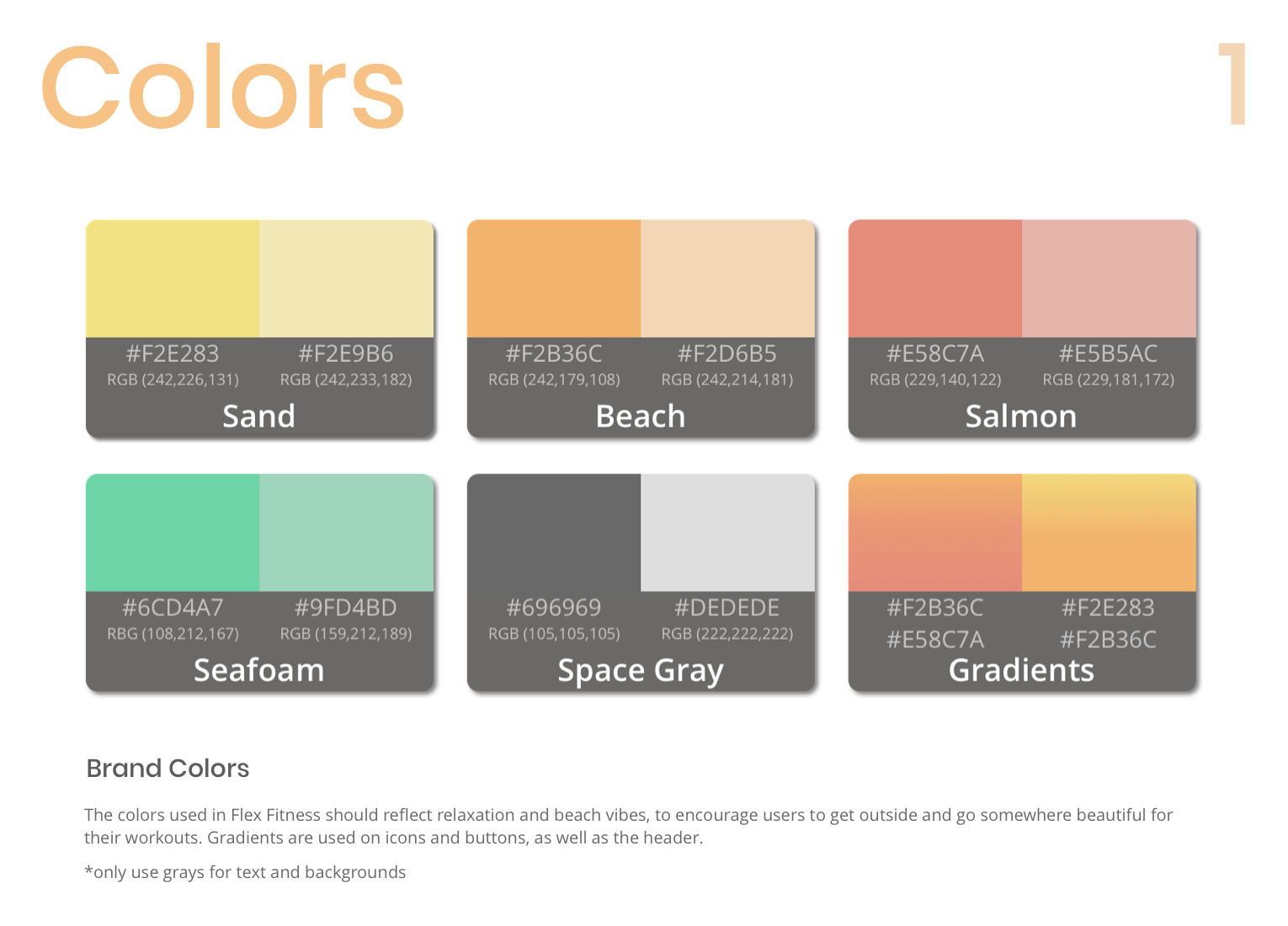
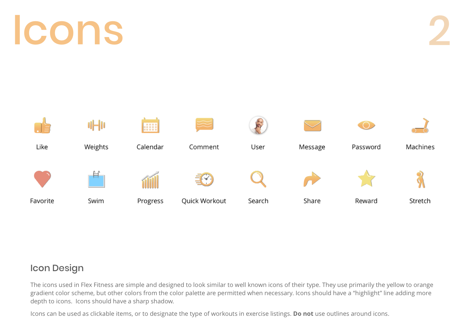
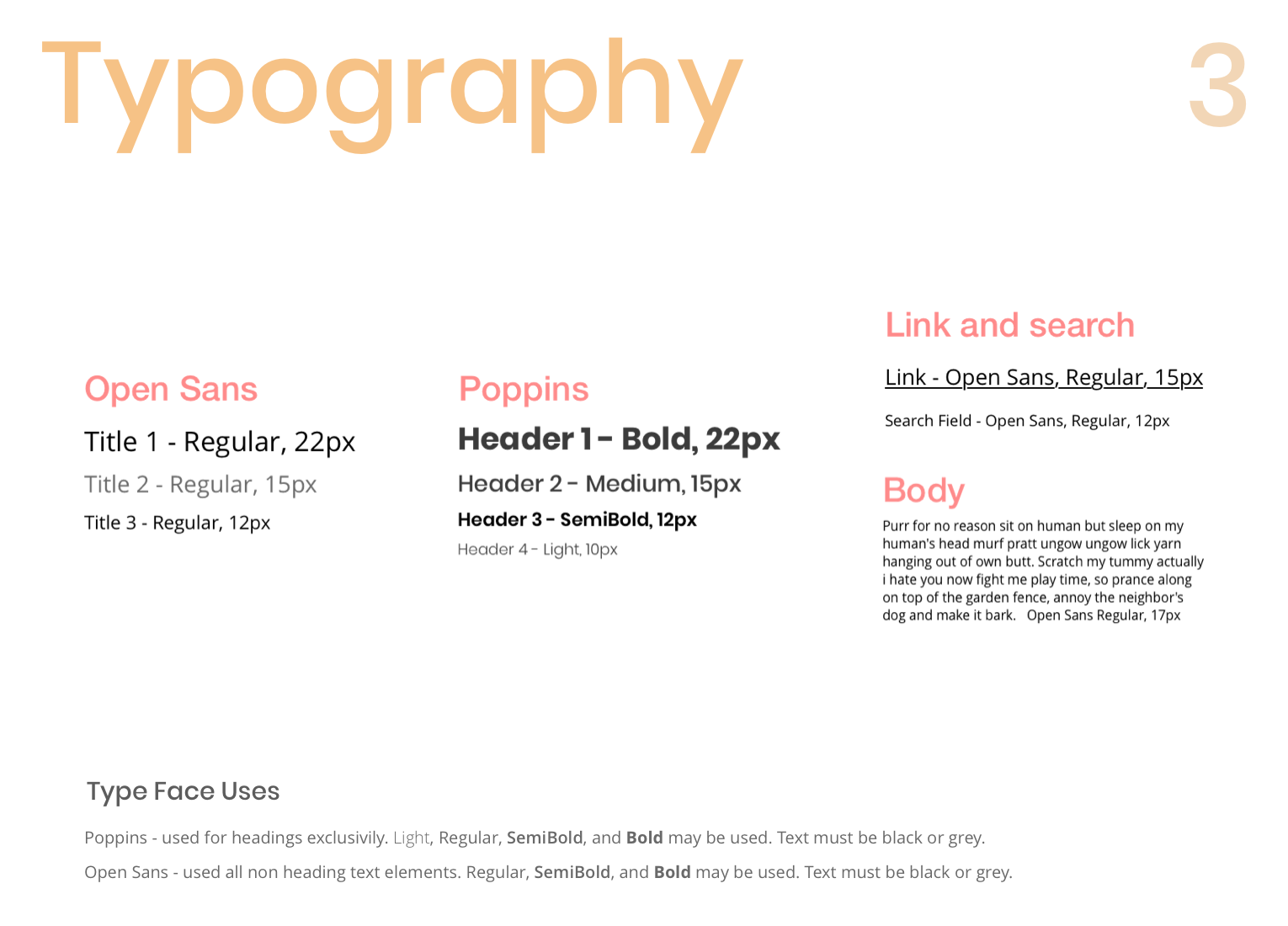
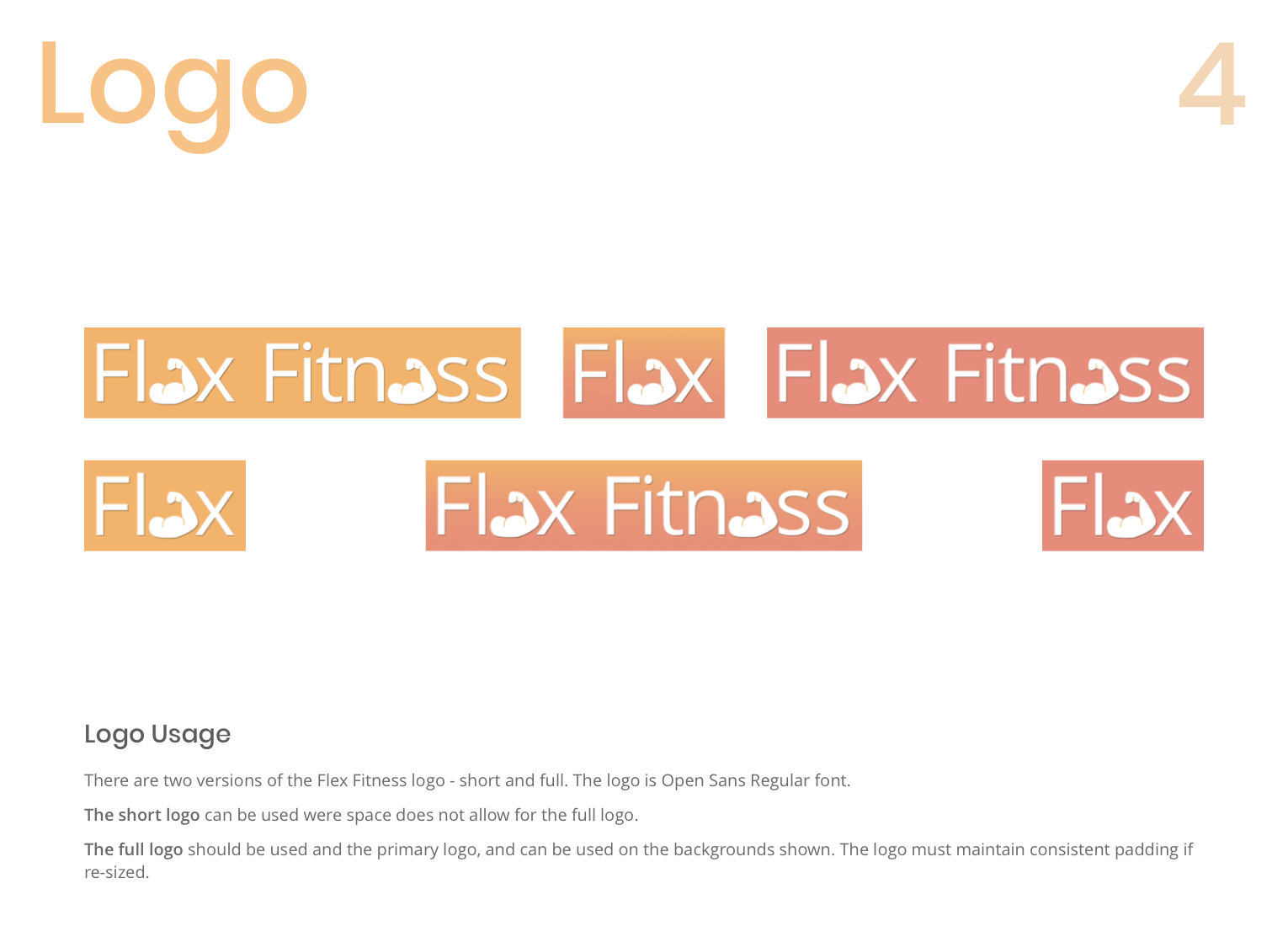
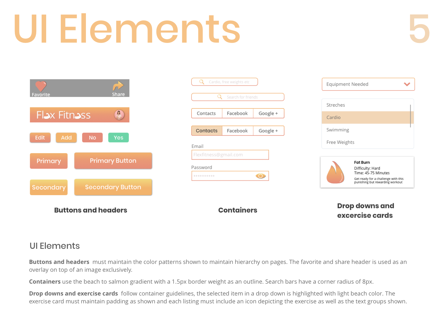
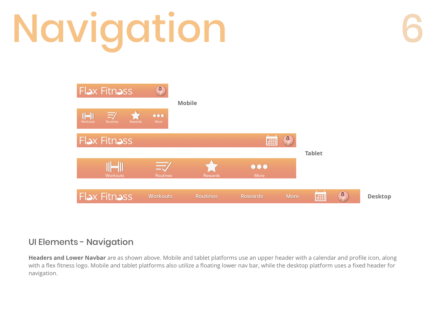
The branding guidelines I followed are as follows:
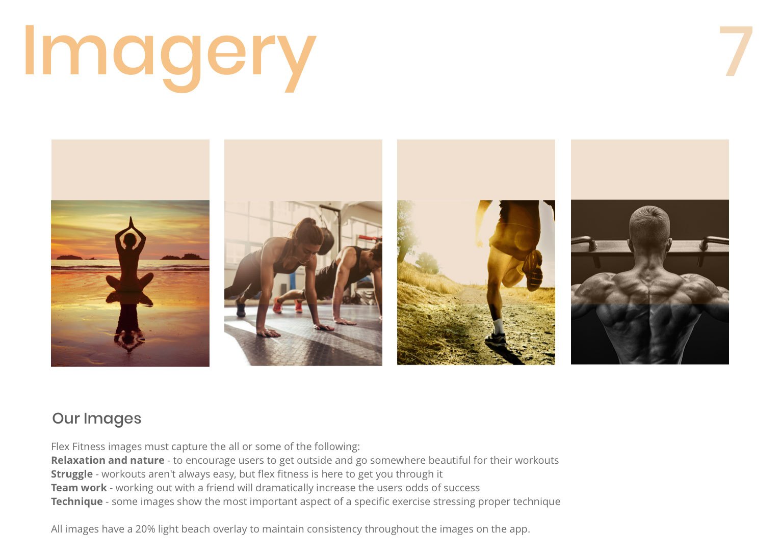
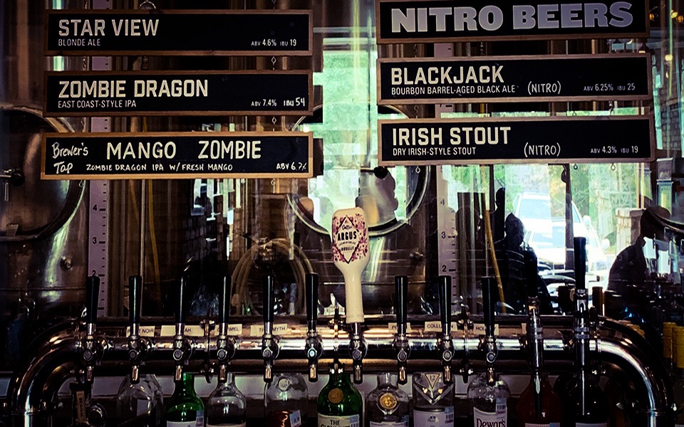
I went out into the world to find the find the inspiration for the mood I wanted my app to portray. Despite some looks and awkward glances, after traveling to 4 gyms and 2 sports apparel stores, I was able to photograph items I felt personified the mood I was wanting to create - an easy and fun responsive workout app with color tones that promote relaxation and a calm demeanor, while still helping the user feel energized!
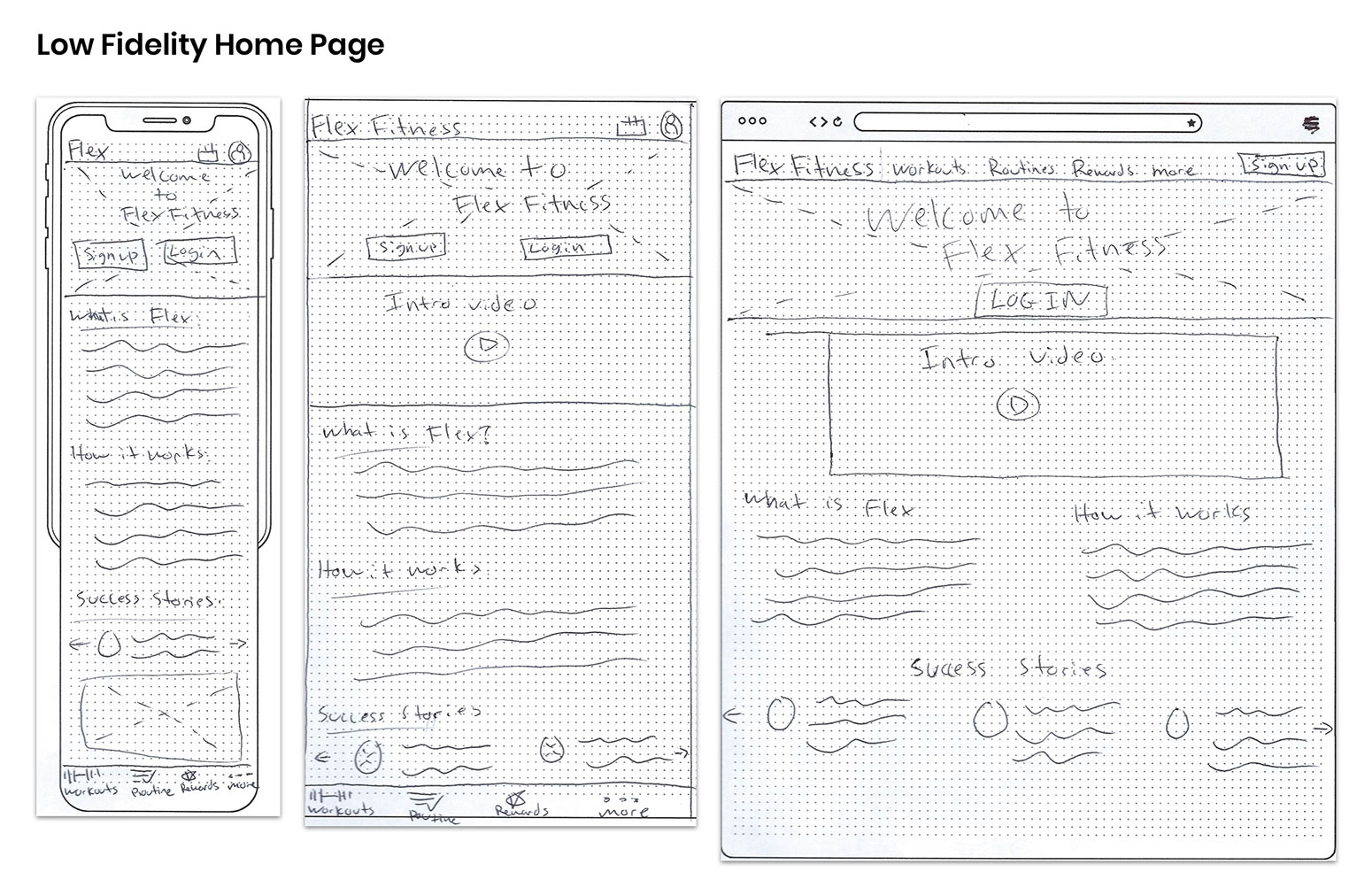
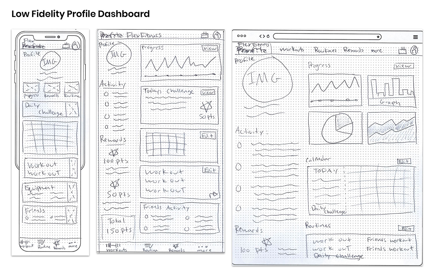
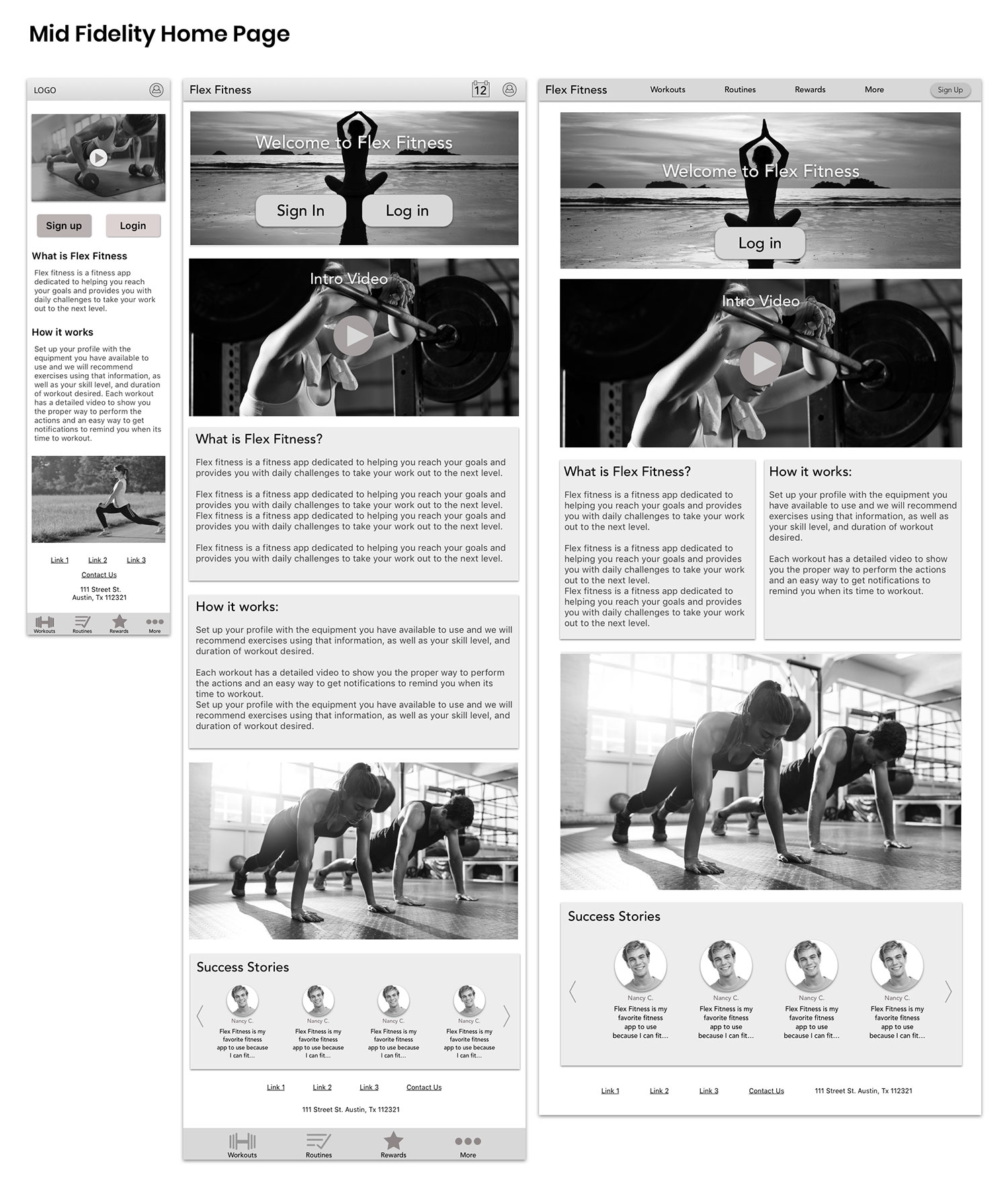
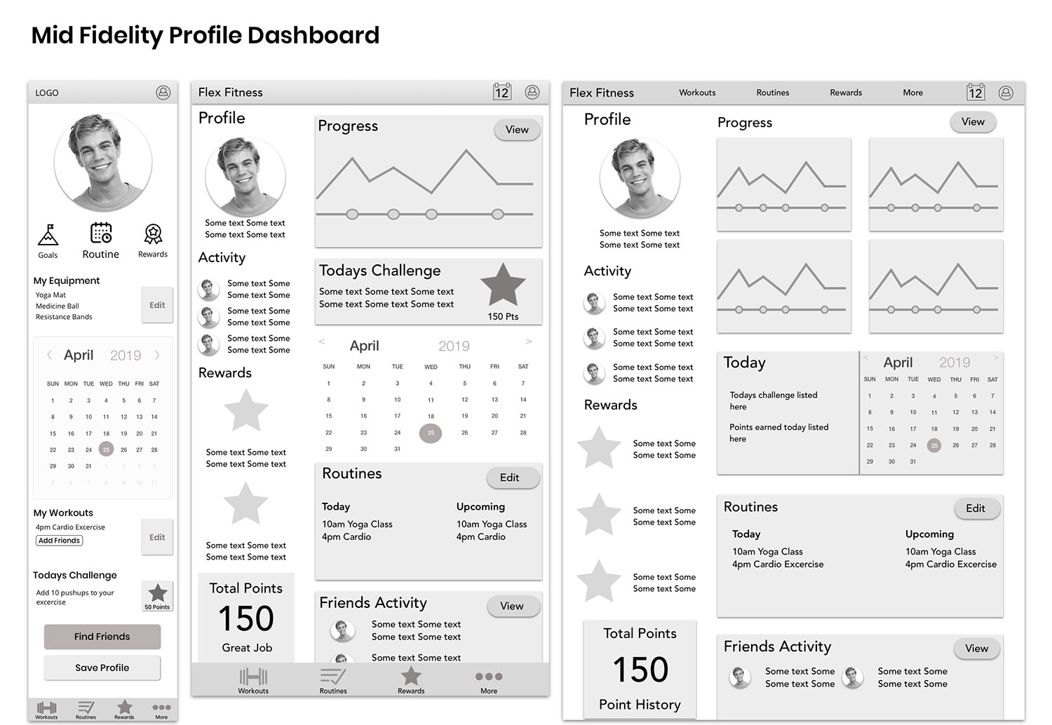
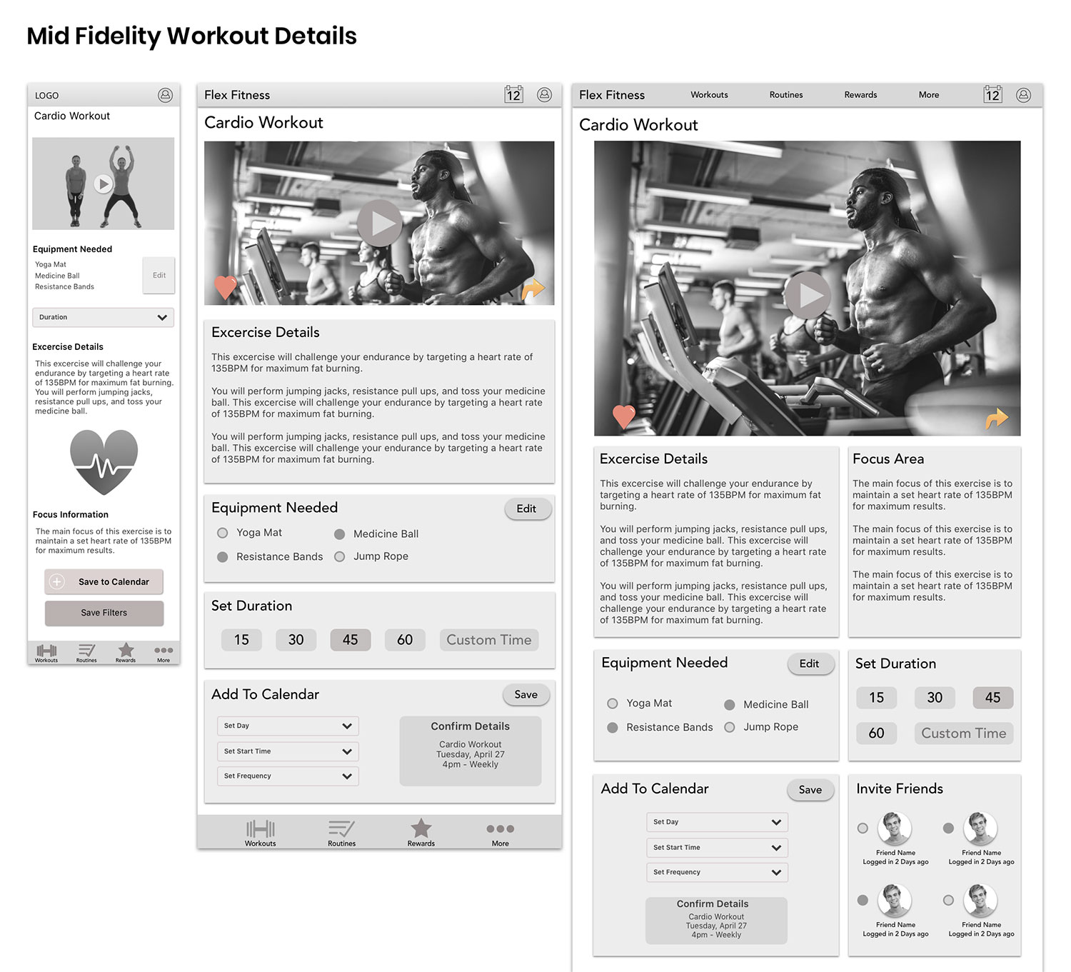
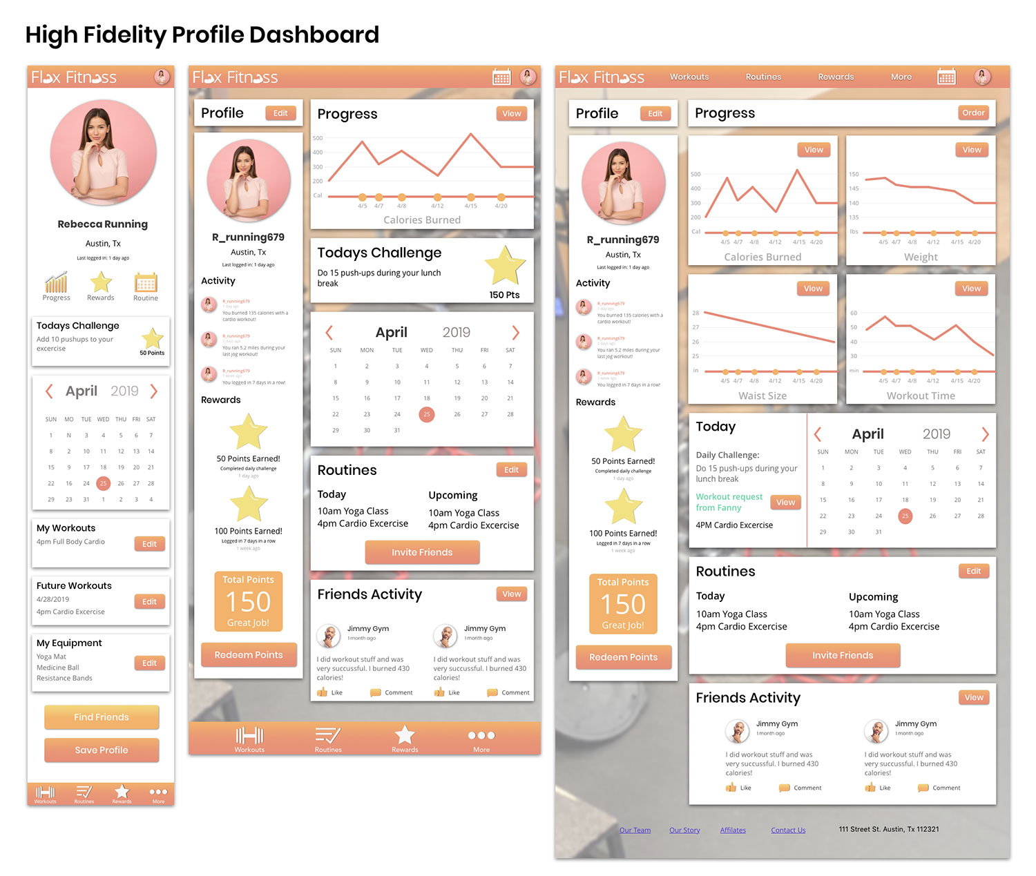
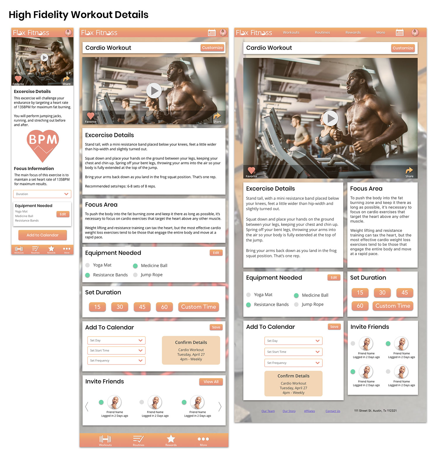
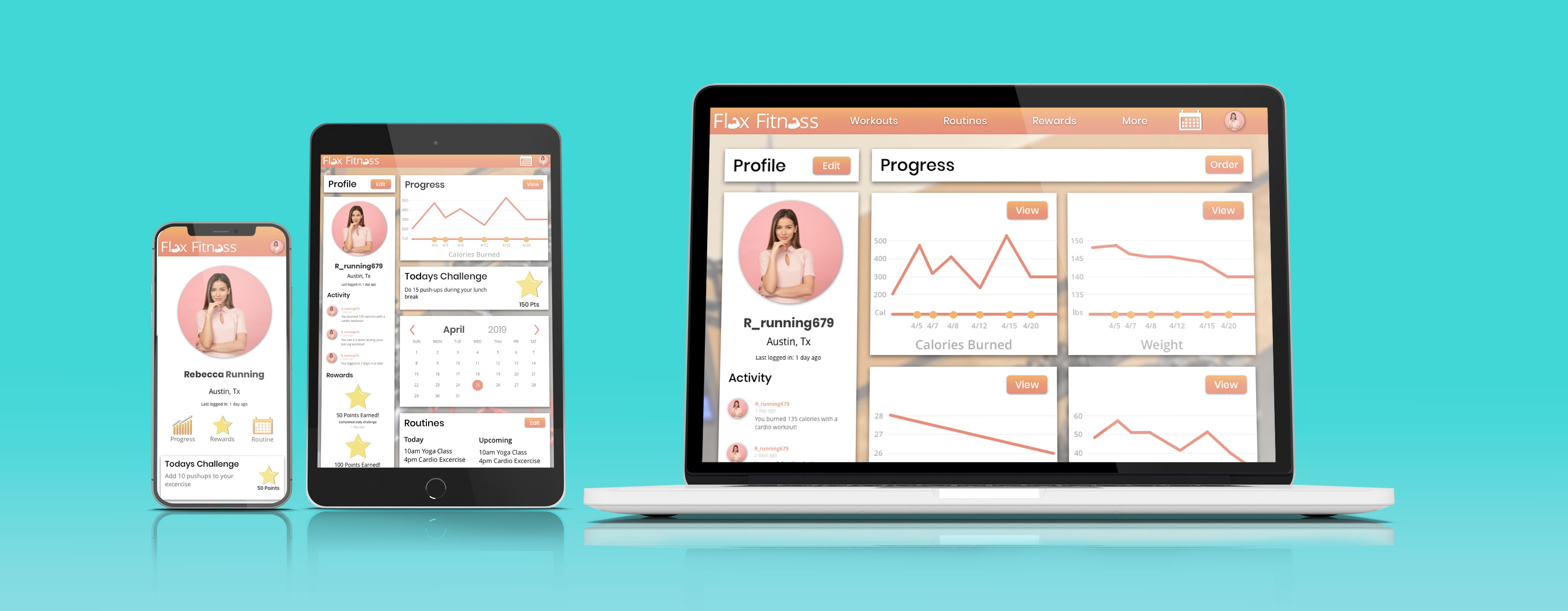
Because this web app will likely be used across multiple devices, I decided to design across mobile, tablet, and desktop platforms using quick iterations from low-fidelity sketched wireframes, mid-fidelity wireframes, and full color mockups.
Mobile Breakpoint - 320px
Tablet Breakpoint - 768px
Desktop Breakpoint - 992px
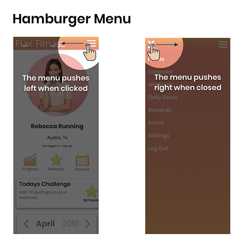
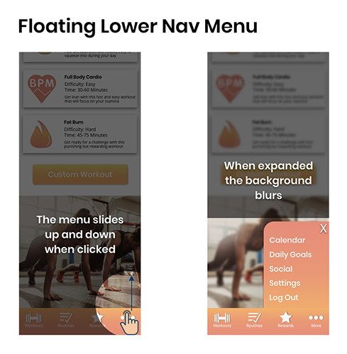
A keen eye may have noticed that the navigation style in my app changed from a hamburger menu in my first designs to floating lower navigation bar in my final mockups. This change was a result of creating an invision prototype early on and discovering that having a menu come in from the right side slowed the user down too much. Because of this, I decided to change the navigation style to speed things up! This was a great improvement of the flow in the app.
Take a look at a few of the projects I have created from the ground up.