BeerQuest
A new way to explore local breweries and craft beer near you.


BeerQuest combines the challenge and fun of a scavenger hunt with the delicious reward of discovering your favorite new beer, getting free stuff, and maybe even a new favorite hang out spot. Who doesn’t like free beer?
“The driving force behind the craft beer revolution in Texas is microbreweries, which grew by nearly 5,000 percent, up from three breweries in 2005 to 152 in 2017.” - Emily Fraser - Editor of www.cbre.us
"I believe that having multiple categories of scavenger hunts to choose from in a users area will increase the likelihood they will find one they want to do, and this would encourage the user to do more than one scavenger hunt. This will help keep users coming back to use our app." - Original BeerQuest Hypothesis
Building on this hypothesis we carried out user interviews (with complimentary beers of course) to see how some potential users responded to this idea, as well as analyzing their previous scavenger hunt experience for opportunities to improve on the existing market.
At the beginning, my scavenger hunt app “schnizlejaged” was intended to be a scavenger hunt app that would take users on a tour of their city exploring historical monuments, breweries, art installations, and even wineries where applicable.
However.
After talking to users that had done several scavenger hunts, it became clear that an app that is more focused on single “theme” would likely be a better option than integrating all the themes into one app.
There was such a shocking amount of enthusiasm by the people I shared my idea "bar hopping between breweries with a challenging twist," that I changed the scope of the project to focus strictly on breweries.
With that, BeerQuest was born!
Now we had an idea of what users may want to see in a scavenger hunt app, we needed to figure out what our typical and target users may look like to help establish empathy with our users.
This also helped us prioritize functionality based on different audiences.
I created three personas using the interview results. I referred to them throughout the entire app development process. It was fun to get into character and bring these to life!
My personas included the following sections: demographics, quotations, goals/needs, motivations, frustrations, personality, and device and internet usage.
Tony - "I want a way to find new friends and fun places to hang out. I'm also looking for a fun way to unwind after a long week at work that's different than the usual bar scene."
Robin - "I need to have relaxing but engaging off time without the kids occasionally, with that being said, I do need fun activities that the kids and I can do on the weekends as well."
Melvin - "I need fun outdoor actives that both me and my dog can enjoy, and hopefully something that is social as well - I would love to meet a nice lady with similar interests along the way."
Developing characters in the story helped separate myself, the designer, from the user while embracing empathy over prejudice. These personas, acted as a rootage that impacted my design by eliminating my personal bias. It kept me connected to the target user. The more detailed the persona and their story - the more user-centered I have the ability to remain in my projects development.
With solid personas under our belt, we could begin to think about how some pages may look on the app, and how we could meet the needs of our personas by mapping out some user flows.
After mapping out how a user may be able to navigate between the potential pages of our app we could begin to think about how these pages would look and what detailed content would be on them, and refine that content and layout through user testing.
Feel the flow below.
To conduct user testing for BeerQuest I created a usability test plan. The main purpose of this testing was to get a feeling for the usefulness of the overall layout of the app and to see how users interact with the functions provided to determine the level of usability - before we spent the time creating full color mock ups. I wanted to identify the major issues users find while trying to complete the tasks given.
All the participants completed all the tasks quickly. According to the System Usability Scale (SUS) 6 of 6 participants agreed that the system was overall easy to use.
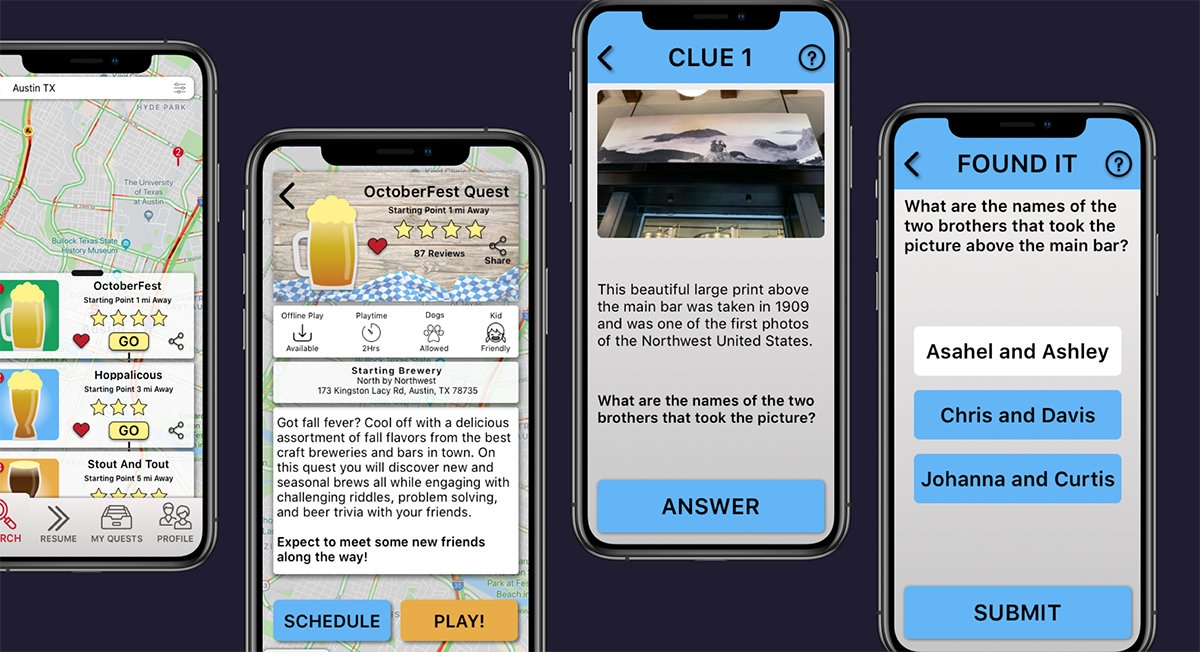
During the later prototype versions on inVision, several users liked the layout, feel and idea of BeerQuest so far, but they were left wondering how you would actually play the quest and how you would move from clue to clue and brewery to brewery. I had only included one example of a clue and it wasn't quite enough to bring my idea across.
After this feedback I went though and more than doubled the number of game play and clue screens by adding a new portion of the quest which allows you to start your quest in a brewery, message your friends, solve multiple clues, and find your way to the landmarks and other items that help you find the next brewery.
From rapid fire paper screen sketches to a high fidelity interactive prototype, wire-framing and prototyping was a crucial step in the BeerQuest development process.
Working closely with potential users and my UX designer peers was the most important aspect of building these.
Take a peek into how a few screens have evolved from my first ideas to what it is today.
Tools used: Pen and paper. Balsamiq. Sketch. Invision. Prott.
Take a look at a few of the projects I have created from the ground up.